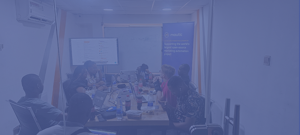
Website rebuild working group weekly meeting
August
13
2024
-
Online
-
10:00 AM
-11:00 AM UTC
A meeting of the working group which is redesigning and building the new mautic.org.
Meeting Minutes
Attendees
- Ruth Cheesley
- Sven Döring
Resources
https://mautic.atlassian.net/jira/software/c/projects/WR/boards/51/backlog
Previous meeting: https://community.mautic.org/assemblies/website-working-group/f/77/meetings/190
Actions from previous meeting
- Mike will put together two ideas for the homepage based on the two themes that Ricardo had suggested and his own ideas. We hope to incorporate also the styles that we're planning to introduce into the product itself so there's some feature parity. All to provide feedback from tomorrow (24th July) during the following week (Mike and Ruth are both out for two weeks from this Friday)
- Sven to pass the research that Ricardo has done to Marketing so that they can further develop and refine this for use project-wide.
- To start using the Jira board in two-weekly sprint cycles so we can plan, estimate and assign tasks and ensure folks receive contribution credits for the work they're doing.
Notes from this meeting
- Reviewing the wireframes which have been done:
- Decision:
- Homepage design is good to go forward for building / design mockup
- We don't think that the Product and Community pages for this to be approved to forward for design - we need to ask Anderson to finish those pages as we don't understand the large blocks of white space.
- Product: Will the video be full-width?
- Product: What will the features look like? Reusing blocks from homepage?
- Community: Also needs tidying up - there's some gaps which need clarifying and it's not clear what the acual layout will be with the blocks
- Members and partners: We have some questions about the visual differentiation, and there's some missing features like the search/filter. Also the individual page seems unfinished
- Blog: seems unfinished also, and there's no individual blog page wireframe
- Resources, solutions and trials pages don't seem to be complete yet.
- Reviewing the design proposals from Ricardo
- While they aren't fully complete, we prefer to stay with the Mautic brand colours/style and make sure that we convey the playfulness and the uniqueness of the open source offering. The darker colours seem a bit too corporate and too 'same-y' - it could be a bank or a fintech company, whereas our colour and style is something unqiue to Mautic.
- Let's stick with the pale blue Mautic colour, with or without gradient - but be true to our unique identity
- We can consider incorporating some of the design work we're doing/proposing with the UX/UI project perhaps.
- Focus for the next week:
- Finish the wireframes which are started but not complete, and address feedback
- Start design mockups for the homepage
- Start wireframes which aren't yet underway
- Get some formal quotes for hosting the new website on at least three providers.


Share