User Experience / Interface Tiger Team
#MauticUXUI Driving Innovation: Shaping Engaging and Intuitive User Experiences
Create information cards on the Campaigns page about resources associated with them
It focuses on creating a relationship between the different parts of the platform. People who are new to Mautic sometimes have difficulty understanding that, for example, campaigns can be associated with a specific type of form and also a specific type of email, as well as they can be combined with landing pages to create a complete strategy.
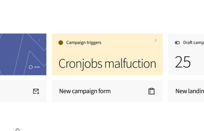
Here we have a concise fast access to resources associated with campaigns plus some indicators (like the cronjob status)
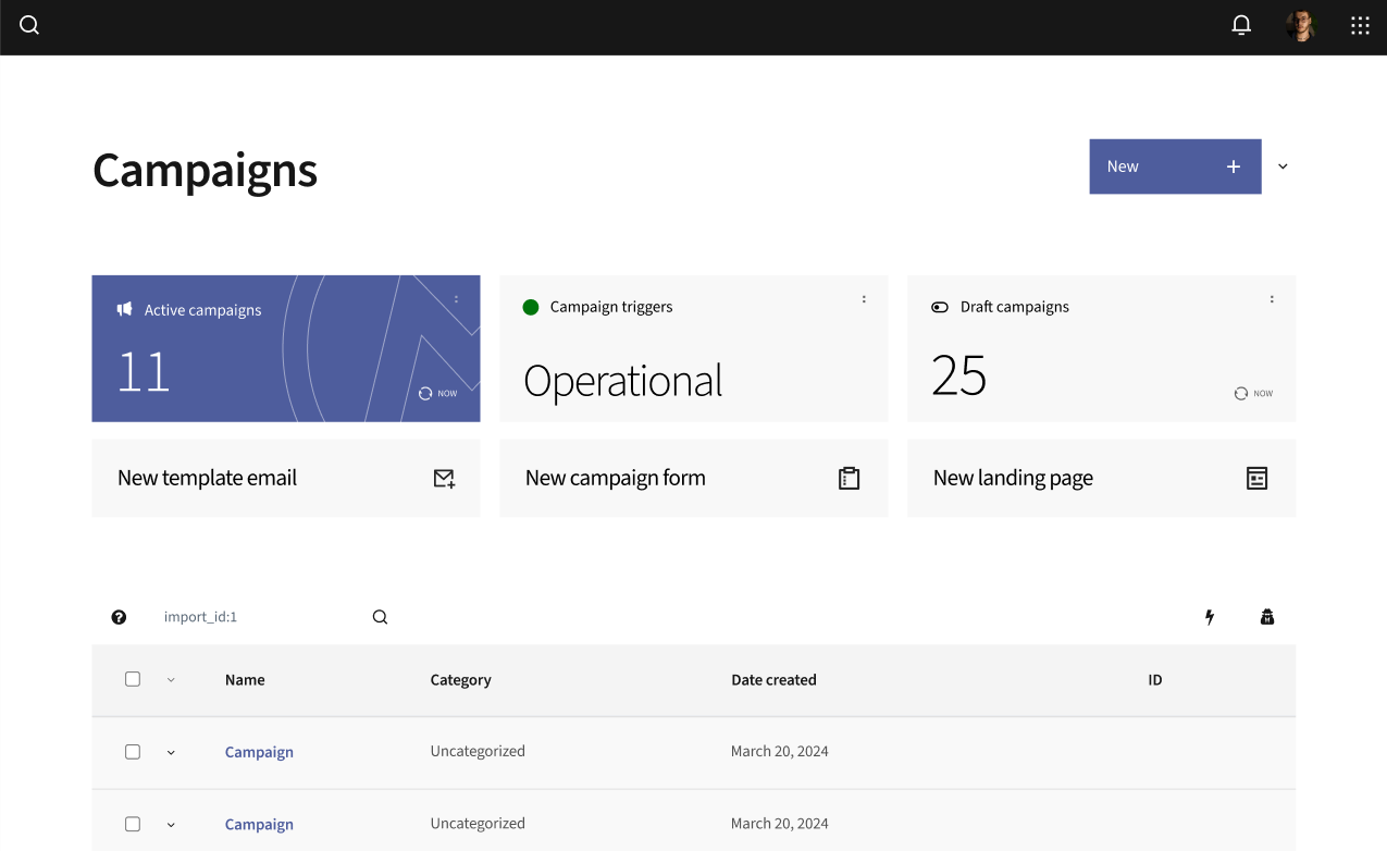
What do you think about this approach? Is it there something even more important that should be here?
Share your thoughts.
Report inappropriate content
Is this content inappropriate?
Close debate
What is the summary or conclusion of this debate?
Comment details
You are seeing a single comment
View all comments
I quite like the integration of an alert telling you that a cron job might be failing - it's bringing the contextual information into the place where it's relevant to know that information. I guess it would be dependent on this feature: https://community.mautic.org/processes/roadmap/f/43/results/2 which is currently being refactored for Mautic 5. So that part, I think is helpful, however the way it's implemented takes up space if there isn't any problem to report, which honestly I think is a little wasteful of attention. I'd have thought a simple notification telling you there's a problem with the cron jobs might be more space-efficient in that case, which only shows if the cron jobs are failing?
I'm not sure about the three 'new' options that you selected, wouldn't it make more sense to have 'new campaign' there instead of landing page? If that were there, would we have a need for the separate 'new' button top-right, for example?
Also, it's not actually relevant to know how many campaigns are active or draft, is it? What would be the value in that (other than being pretty tiles to show in the interface) to the marketer, unless you're being charged by the number of active campaigns?
My other thought is that this proposed layout takes up a _lot_ of screen real-estate, over half the page. Is that helpful if you don't need those buttons to be shown? Would they be collapsible for example? I don't know that it adds much to the user in terms of making it easier to use Mautic.
So I'm neutral on this proposal. In summary:
I think that the active/draft tiles are unnecessary and just add (pretty) clutter that doesn't give meaningful value
I think that the quick buttons to add new could possibly be helpful, however I would think new campaign makes more sense rather than new landing page.
Loading comments ...